In today’s data-driven world, creating dashboards that are both insightful and easy to interpret is crucial. Efficient data visualization techniques turn raw numbers into actionable insights, helping businesses make faster and smarter decisions.
In this blog, we’ll explore five key techniques for efficient visualization, based on real-world examples from Power BI reports: KPI charts, Conditional formatting, Combination charts, Pivot tables, and Dynamic labels.
Technique #1 – KPI Charts: Highlight What Matters Most
KPI (Key Performance Indicator) charts are the heartbeat of any well-designed dashboard. They present critical figures in a bold and prominent way, ensuring users immediately grasp the most important metrics.
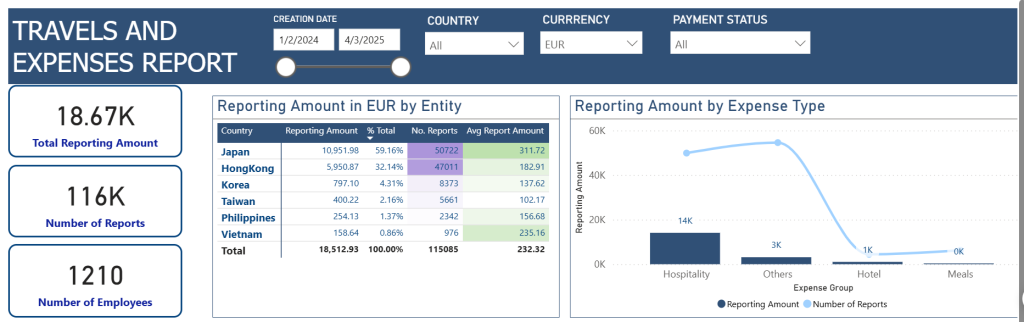
In the Travel Expenses Report, large KPI cards display the total reporting amount, the number of reports, and the number of employees. This simple yet powerful design choice enables quick assessments without diving into detailed tables.
Tips:
- Always use KPI cards for high-priority metrics.
- Keep the layout simple with big fonts and a minimalistic design.
- Group related KPIs together for faster cross-referencing, a smart approach to dashboard design.
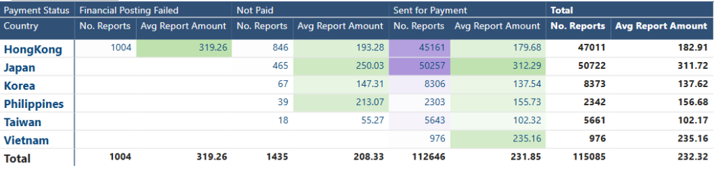
Technique #2 – Conditional Formatting: Focus User Attention on Exceptions
Conditional formatting brings data tables to life by automatically applying colors or icons to highlight trends, outliers, and important statuses – a visual technique essential for spotting exceptions quickly.
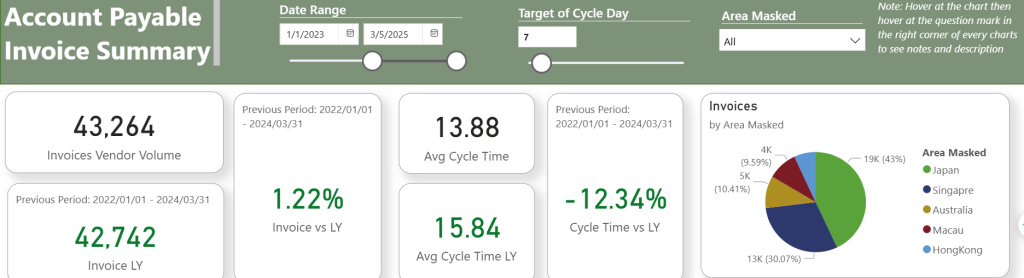
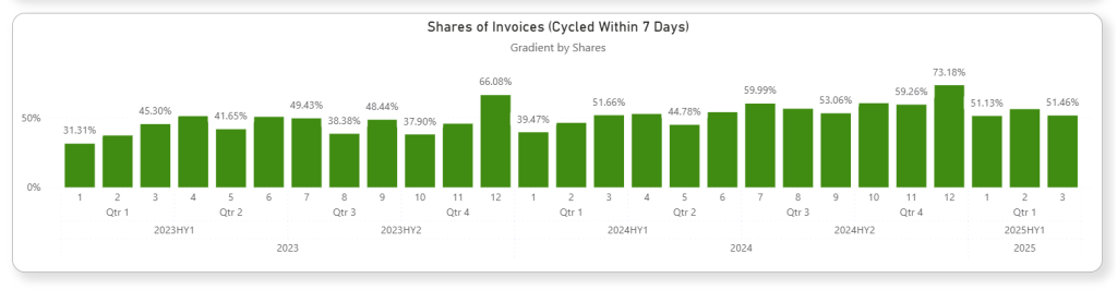
In the Power BI Expense Report, the Reporting Amount table uses conditional formatting to quickly distinguish countries with higher reporting amounts. Similarly, the Account Payable Invoice Summary uses color to flag improvements or declines in invoice cycle time.
This is one of the more accessible data visualization techniques for business users, requiring little to no code to implement.
Tips:
- Use color coding (green for positive trends, red for negative) for instant visual cues.
- Apply formatting carefully — too many colors can create confusion.
- Set threshold rules that align with business goals.
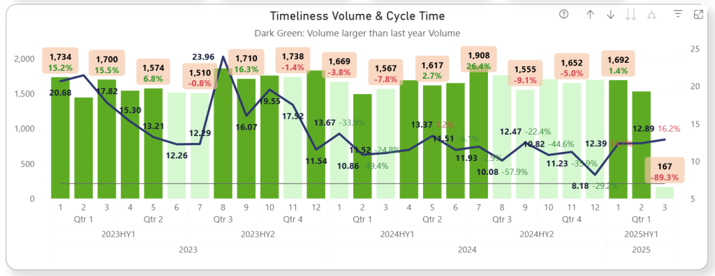
Conditional formatting can be applied not only on the table format, but also on the data label format. By the combo chart, the growth in red means negative growth, the growth in green means positive growth. Similar to light green color and dark green color on the chart.
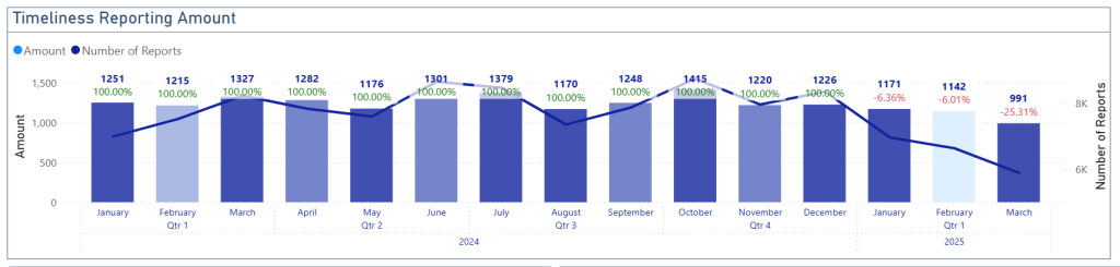
Technique #3 – Combination Charts: Show Trends and Comparisons Together
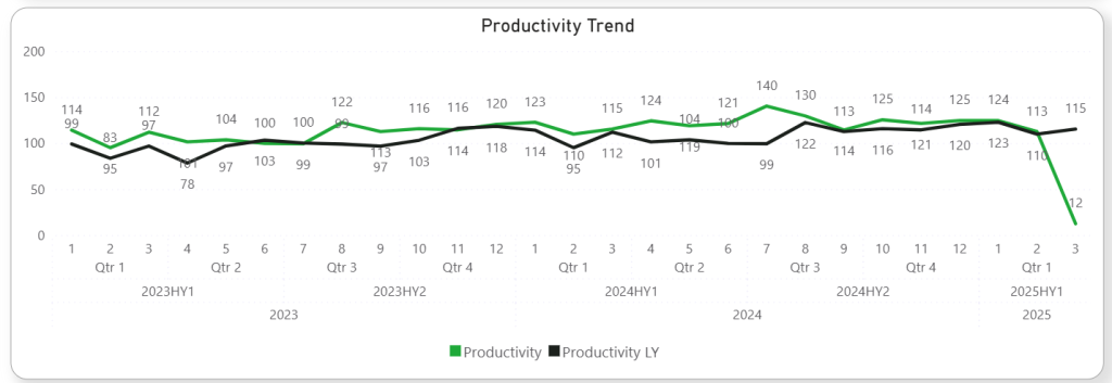
Combination charts, blending columns and lines, deliver multiple layers of information in a single visualization. They are perfect for showing overall volume alongside growth trends.
Using a combo chart doesn’t just add variety — it prevents the chart from looking too simple or shallow. This type of data visualization technique adds depth to reporting by overlaying related metrics in a single chart — a great choice when screen space is limited or when comparing dimensions over time.
In the Timeliness Reporting Amount section of the Travel Expenses Report, column charts depict the number of reports while a line chart overlays the reporting amount trend. Detailed growth labels and gradient coloring on columns add even more clarity.
Tips:
- Use the column for volume or quantity and the line for percentages or rates.
- Add growth labels directly onto the chart to eliminate guesswork.
- Use gradient colors to highlight performance intensity (e.g., darker shades for higher values).

Technique #4 – Pivot Tables: Enable Deep-Dive Comparisons Across Dimensions
When users need to explore data across different variables, pivot tables shine. They offer a dynamic view of the data and are an essential part of advanced data tools.
Among the most powerful analytical dashboard features, pivot tables help users drill into details without switching views.
This is one of the most underutilized data visualization techniques when it comes to empowering users with exploration and comparison flexibility.
Technique #5 – Dynamic Labels: Provide Real-Time, Contextual Insights
Dynamic labels automatically update based on filter selections or changes in data, making the dashboard more interactive and relevant to users.
This subtle yet powerful interactive reporting technique enhances user experience. In both reports, growth rates, cycle times, and amounts dynamically adjust when users change the date range or filter by country. This immediate feedback allows decision-makers to explore “what-if” scenarios effortlessly.
Tips:
- Use dynamic labels to display % change, YOY growth, or filtered totals.
- Always format dynamic labels clearly (e.g., “+12% increase” or “-8% decrease”).
- Place dynamic labels close to their related charts for maximum impact.
For more best practices on reporting, visit Microsoft Power BI official blog.